


You are reading this post means you have just started learning flutter, and now every tutorial or codelab you open you came across a widget named Scaffold. Do not worry after reading this blog post you will have a clear understanding of Scaffold.
If you have any problem setting up your flutter development environment refer to my flutter installation post where you can find a step-by-step guide.
Let’s get started.
What is a Widget?
The Flutter app’s screens are made up entirely of widgets. You build the UI using widgets and the appearance of the UI depends on the choice and sequence of the Widget. Some examples of widgets are Scaffold, Text, etc.
Now you have a clear idea about widgets we can move forward to the scaffold, in this blog post we will be discussing the basics of Scaffold.
What is Scaffold?
The Scaffold is a widget in Flutter used to implement the basic material design visual layout structure. It provides APIs for showing drawers, app bars, bottom navigation, and bottom sheets.
In simple words, Scaffold provides you with a structure where you put widgets according to your needs while simultaneously following material design.
The following are the Scaffold constructor and properties.
const Scaffold({
    super.key,
    this.appBar,
    this.body,
    this.floatingActionButton,
    this.floatingActionButtonLocation,
    this.floatingActionButtonAnimator,
    this.persistentFooterButtons,
    this.persistentFooterAlignment = AlignmentDirectional.centerEnd,
    this.drawer,
    this.onDrawerChanged,
    this.endDrawer,
    this.onEndDrawerChanged,
    this.bottomNavigationBar,
    this.bottomSheet,
    this.backgroundColor,
    this.resizeToAvoidBottomInset,
    this.primary = true,
    this.drawerDragStartBehavior = DragStartBehavior.start,
    this.extendBody = false,
    this.extendBodyBehindAppBar = false,
    this.drawerScrimColor,
    this.drawerEdgeDragWidth,
    this.drawerEnableOpenDragGesture = true,
    this.endDrawerEnableOpenDragGesture = true,
    this.restorationId,
  })
Let’s take a look glance at Scaffold properties individually.
1. appBar
This is a horizontal bar placed at the top of the app UI. appBar in Scaffold used AppBar Widget which has properties like title, elevation, brightness, etc.
Widget build(BuildContext context) {
    return Scaffold(
      appBar: AppBar(title: const Text("GeekAid")),
    );
  }
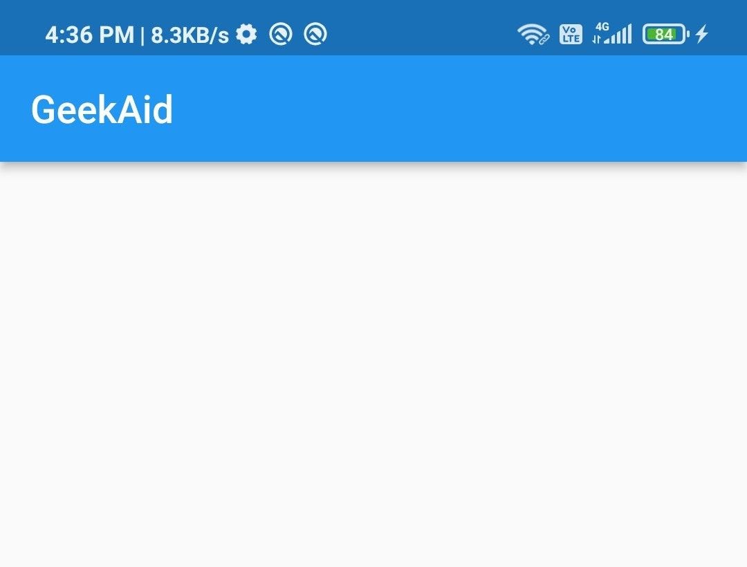
Here, the appBar with the title property uses the Text widget to display the text “GeekAid” on the appBar.
2. body
The body is another essential property of the Scaffold, it is the space present below the appBar and behind the floatingActionButton.
Widget build(BuildContext context) {
    return Scaffold(
      appBar: AppBar(title: const Text("GeekAid")),
      body: const Center(
          child: Text(
        "Scaffold Demo",
        style: TextStyle(fontSize: 40),
      )),
    );
  }
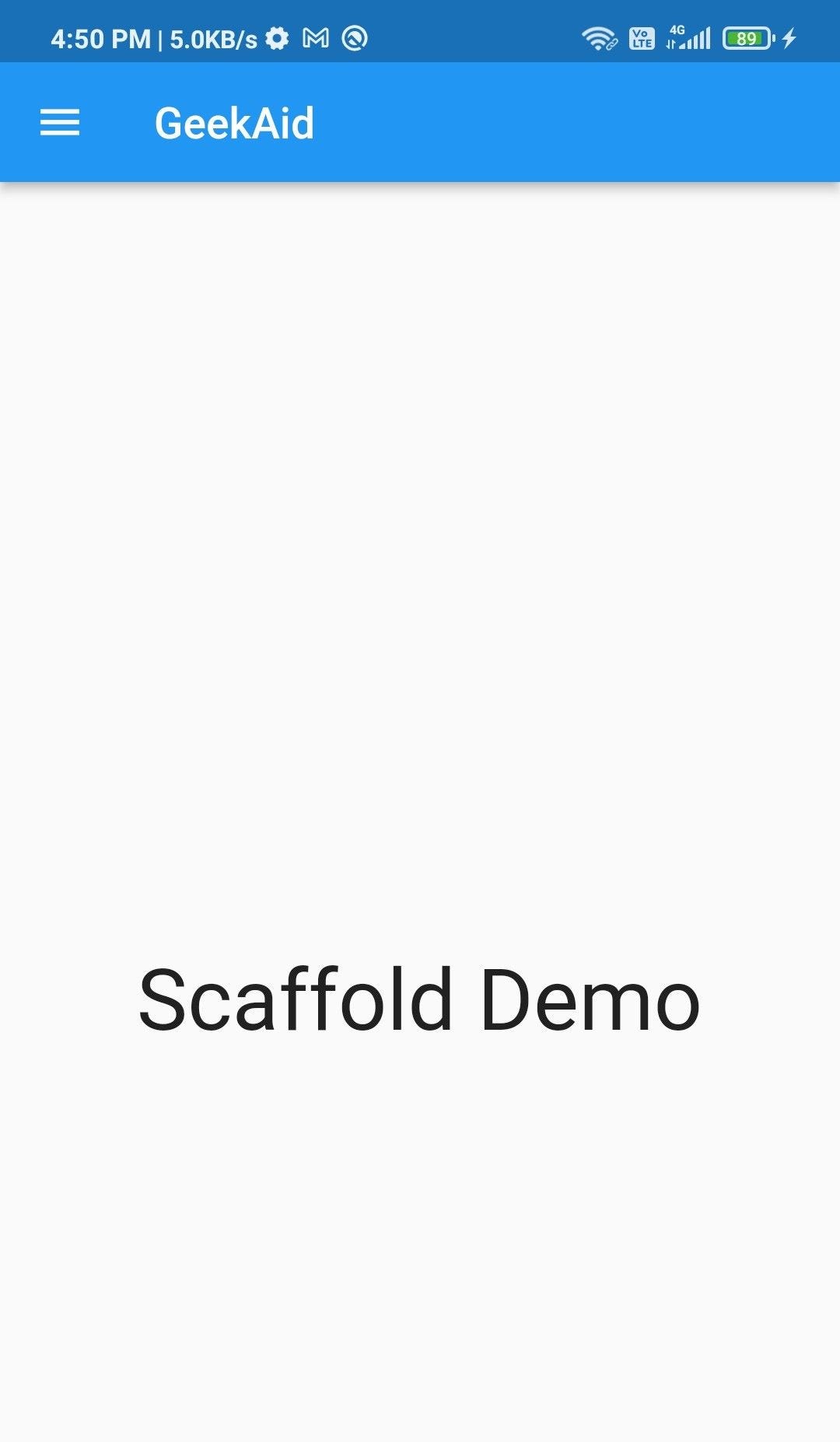
Here, the body property of the Scaffold uses a Centre to center alignment (horizontally and vertically) of the content and Text widget to display the text “Scaffold Demo”.
3. floatingActionButton
a floatingActionButton is a button that is displayed at the bottom right corner floating above the body. floatingActionButton is used to promote some primary action in the app example: add.
floatingActionButton uses the FloatingActionButton widget to display the button.
 Widget build(BuildContext context) {
    return Scaffold(
      appBar: AppBar(title: const Text("GeekAid")),
      body: const Center(
          child: Text(
        "Scaffold Demo",
        style: TextStyle(fontSize: 40),
      )),
      floatingActionButton: FloatingActionButton(
        elevation: 10,
        child: const Icon(Icons.add),
        onPressed: () {
          print("flatingActionButton pressed");
        },
      ),
    );
  }
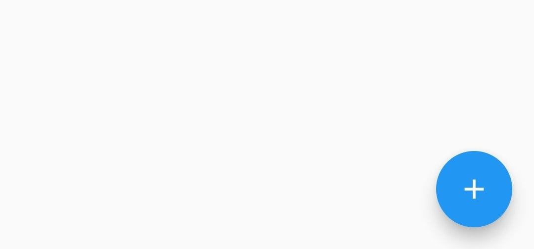
Here, the floatingActionButton property of Scaffold uses the FloatingActionButton widget to display a floating button at the bottom right corner. It uses an Icon widget to display the icon.
4. drawer
The drawer is a side panel or slider menu which is generally hidden in mobile devices and which can be accessed by sliding left to right or vice versa.
If you use a drawer in the app an icon is automatically added in the appBar at appropriate positions which can be used to access the drawer.
drawer: Drawer(
  elevation: 12,
  child: ListView(
    children: const <Widget>[
    DrawerHeader(
      decoration: BoxDecoration(color: Colors.orange),
      child: Center(
        child: Text("Geek Aid", style: TextStyle(fontSize: 40)))),
        ListTile(
          title: Text("Item 1"),
        ),
        ListTile(
          title: Text("Item 2"),
        )
    ],
  ),
),
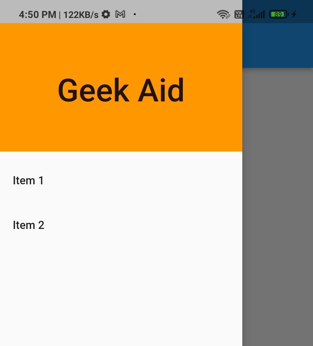
Here, the drawer property of Scaffold uses the Drawer widget to display the sliding menu. The DrawerHeader widget is used to display the header of the drawer and ListTile to display the menu items.
5. persistentFooterButtons
The persistentFooterButtons are placed at bottom of the Scaffold if used with bottomNavigationBar and floatingActionButton then it lies above the bottomNavigationBar and below the floatingActionButton.
persistentFooterButtons remain at their assigned positions even if the body content is scrolled as the name suggests they remain persistently visible.
persistentFooterButtons: <Widget>[
 ElevatedButton(onPressed: () {}, child: const Icon(Icons.search)),
 ElevatedButton(onPressed: () {}, child: const Icon(Icons.send)),
],
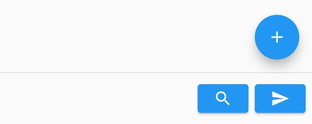
Here, the persistentFooterButtons property of the Scaffold uses a list of widgets to display the widgets above the bottomNavigationBar.
6. bottomNavigationBar
bottomNavigationBar is used to render bottom Navigation below the persistentFotterButtons.
bottomNavigationBar: BottomNavigationBar(
  currentIndex: 0,
  items: const [
    BottomNavigationBarItem(label: "Home", icon: Icon(Icons.home)),
    BottomNavigationBarItem(label: "Search", icon: Icon(Icons.search)),
    BottomNavigationBarItem(label: "Lock", icon: Icon(Icons.lock)),
  ],
),
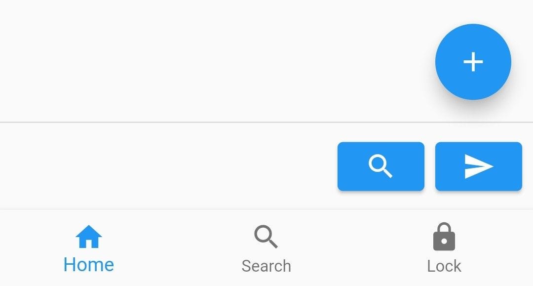
Here, the bottomNavigationBar property of the Scaffold uses the BottomNavigationBar widget to display the bottomNavigationBar. BottomNavigationBarItem is used to display the navigation icon and add a label to it.
These are some primary properties of scaffold we have discussed, now go ahead and start tweaking these properties one at a time to get a clear understanding and hands-on.